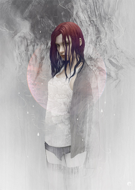
Still in artrage some texture gets blocked in using the oil textures and pallet knife. Then i can move over to painter and get the flesh painted in using the oil brushes and then its all photoshop from here on. Panel 3 shows the base shape of the hair painted in using a rough, almost fur or grass type brush.

This is painted on a few different layers and then merged together when im happy with the shape. A layer mask is added and using the same brush- but a lot finer, I paint in the mask to clean up the shape of the hair- it also allows you to create gaps in thicker strands to allow light through and also is non destructive to the original paint.

The next 2 panels show the detail being added, using a combination of brushes and the blur tool- layers are built up over the base hair layer as 'clipping masks', meaning that when you paint on each consecutive layer, paint is only visible where it overlays the base hair layer. Once the detail and form is done, final tweaks can be made- including a layer, set to color with reduced opacity where a tint of pink and blue is added.
The Third panel shows the vest started- a dark gray base shape layer is marked in using the pen tool then a solid white fill adjustment layer is created above and 'clipped' to the base shape. Then the folds are brushed in on the layer mask. This has the advantage of letting you adjust colors quite far down the process without too much hassle.

Further layers of texture and pattern are added to the vest stack using a variety of blending modes and opacities. The rest of the clothing is handled in a similar fashion, the jumper gets a basic shape drawn out with the pen tool which is saved and used as a group mask in which multiple layers of texture are added, each having their own masks which are in turn brushed using various textures. As the lower half of the body is only going to be partially viewable i dont worry about being too precise in creating her pelvis and thighs- painted in using a default hard edged brush does the job.
Once the clothing is done, each items group (eg the vest is one group of layers, the jumper is in another and finally the waist down) gets a mask and more texture is added, this is done in a couple of ways- texture brushes roughly painted in and also taken from texture photos. A pretty simple way of doing this is to find something with a suitable contrast, paste the image in on top of where you would like to add the texture. Once its there lower the opacity so you can align or scale it to your liking, reset the opacity to 100 and go to the channels tab, choose the best channel for the textures contrast and ctrl click the thumbnail. This loads the channel as a selection, hide the actual pasted texture layer, select your group mask and paint some black over the selection.

Next the background texture is created at the bottom of the layer stack, using some photo texture, brushes and masking. Back up at the top- the thread lines are simple paths drawn with the pen tool and 'stroked' with a default brush set with a pixel or two of blur and 'simulate pressure' checked. The resulting lines are slightly blurred and enhanced, grouped within a folder where yet another mask is made and areas brushed out and softened.
Finally in a separate top folder, additional texture, vector details, accent colors and touch-ups are made before a flattened version gets a small amount of noise added.
Final artwork and details.